6 Estimating Demand
Turning what people told you into a curve you can reason with
Everything so far has been about learning: framing the question, designing evidence that could answer it, getting the right people to answer honestly.
What you have at the end of that is a spreadsheet. Forty rows, a column of prices, maybe a column of quantities. It is evidence, and it is not yet something you can make a decision with.
This chapter turns that column into a curve. The move is more intuitive than its reputation suggests, and it happens in two steps that are worth keeping separate, because one of them is nearly mechanical and the other is where all the judgment lives.
Estimation Builds, It Does Not Discover
People talk about finding a demand curve, as though one were out there waiting to be measured the way you measure a temperature.
Nothing is waiting. A demand curve is constructed, from evidence, using assumptions about how people behave and how their answers add up. That makes estimation an interpretive act rather than a neutral processing step, and knowing which parts are interpretation is most of what this chapter is for.
The two steps:
Counting. Take the individual answers and work out, at each price, how many units would be bought. This step assumes almost nothing beyond the answers meaning what they say. It produces an empirical demand curve made entirely of your respondents.
Fitting. Lay a smooth mathematical shape over those points so you can reason about prices nobody was asked about. This step assumes a great deal, and every assumption is a claim about behavior you did not observe.
Most of the trouble people get into with demand estimation comes from running the two together and treating the output of the second as though it had the innocence of the first.
What estimation cannot do
An estimate summarizes what your evidence implies if its assumptions hold. It makes no claim that those assumptions are correct, complete, or stable, and it is not a forecast of what customers will do.
Treat the curve as a lens rather than a prophecy: it shows how price and quantity are related given what you know today. When new evidence arrives the curve should move. That is the instrument working, not failing.
From Answers to a Curve
Here is the step that turns a column of numbers into economics. It is the most important move in the book and it takes about a minute by hand.
When the decision is yes/no
Suppose you asked twelve people for the most they would pay for one prepared meal, and got this back.
| Respondent | Max WTP |
|---|---|
| R1 | $12 |
| R2 | $8 |
| R3 | $15 |
| R4 | $10 |
| R5 | $5 |
| R6 | $12 |
| R7 | $18 |
| R8 | $9 |
| R9 | $12 |
| R10 | $15 |
| R11 | $8 |
| R12 | $10 |
Now ask a question you can answer by counting. If the price were $12, how many of these people would buy?
Everyone whose maximum is $12 or more. Scan the column: R1, R3, R6, R7, R9, R10. Six people, so six meals.
Do that at every price anyone named and you have a demand curve. The mechanical version is to sort by willingness to pay from high to low and keep a running count.
| Price | Buyers at exactly this price | Quantity (running count) |
|---|---|---|
| $18 | 1 | 1 |
| $15 | 2 | 3 |
| $12 | 3 | 6 |
| $10 | 2 | 8 |
| $9 | 1 | 9 |
| $8 | 2 | 11 |
| $5 | 1 | 12 |
That is the whole transformation.
Line everyone up by what they would pay, then count who is still standing at each price.
The running count is quantity, and price and quantity together are a demand curve.
It is worth pausing on why this works rather than accepting it as a trick. Each person’s maximum willingness to pay is the price at which they drop out. Below it they are in, above it they are gone. So the number of buyers at any price is simply the number of people whose drop-out point is at or above it, and counting them from the top down is the fastest way to get that number at every price at once.
Figure 6.1 plots the result.
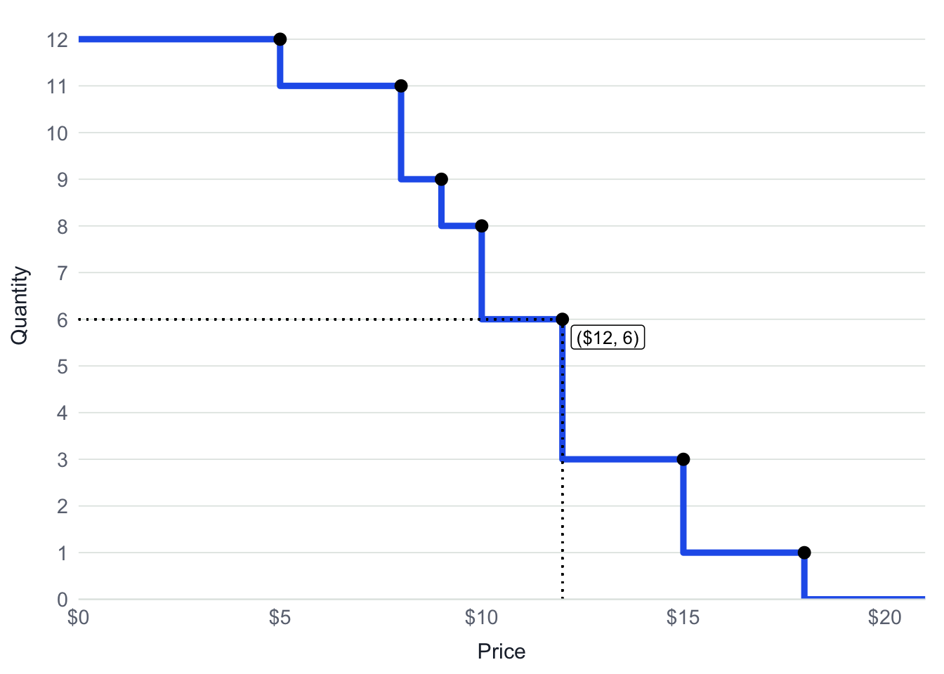
Notice what this object is. It is not a model and it contains no assumption about anybody who was not asked. Every step down is one respondent leaving. With twelve people the staircase is coarse; with two hundred it looks very nearly like a smooth curve, because it is the same construction with smaller steps.
You do not have to take that on faith. The slider below keeps adding respondents drawn to look like the twelve you already have, and the staircase refines as they arrive.
For the Curious — What you just built has a name
Sorting a set of values from high to low and counting how many remain above each threshold produces the survival function of a distribution: the fraction of the sample still above any given level. It appears wherever people study how long things last, which is where the name comes from, and it turns out to describe an entirely different question just as well.
Reading it that way, an individual’s maximum willingness to pay is their reservation price, and the market demand curve is the survival function of the distribution of reservation prices across your customers. Demand slopes down for a reason that has nothing to do with any one person changing their mind: it slopes down because raising the price crosses more and more people’s thresholds and they leave.
That is worth holding onto, because it explains something the smooth textbook picture obscures. A demand curve is not one customer buying less as prices climb. It is a population of stubborn individuals, each with a fixed line they will not cross, and the curve is a census of how many are still in.
When the decision is how-many
The counting logic carries over, with one change: instead of contributing a single unit each, respondents contribute a quantity that varies with price.
Recall the three anchors from the previous chapter. Each respondent gave you the quantity they would take if the good were free, the most they would pay per unit, and the quantity they would take at that maximum. Those are two points on that person’s own demand curve, plus a ceiling.
Join the two points with a straight line and you have that individual’s demand from free up to their ceiling. Above the ceiling they buy nothing, because a per-unit price beyond what they will pay does not make them buy fewer, it makes them stop.
Then do exactly what you did before, except that you are adding quantities rather than counting heads. At each price, ask every respondent how many they would take, and add up the answers. That is horizontal summation, and it is the same move as the running count: at each price, total up whoever is still in.
Horizontal summation — adding up what every individual would buy at one price, then repeating at every price to build the market curve.
The prices worth evaluating are the respondents’ own maximums, since those are the only places where the total changes shape. You never had to invent a price grid.
And now the two methods collapse into one. Set every respondent’s quantity to a single unit at any price they will accept, and the horizontal sum becomes a head count, and the head count is the staircase in Figure 6.1. Yes/no demand is how-many demand where nobody can buy more than one. One transformation, two special cases, which is why the same app handles both without switching techniques.
From One Person to a Market
The staircase above describes twelve people. Decisions are made about markets, and getting from one to the other is where the quiet assumptions live.
Individual demand tells you about preference: how much one person values the offering, against their alternatives, under the constraints they perceive. Useful, and it cannot answer how many units would we sell at this price or is this large enough to justify entry. Those questions are collective by construction.
Aggregating requires deciding who belongs in the population, how much each response should count, and how the variation you observed maps onto the people you did not observe. Those are sampling questions arriving late, and they are the reason the previous chapter mattered.
The asymmetry is worth naming plainly. Individual demand can be interesting even from a convenience sample. Market demand cannot. Once you multiply up, you have made a claim about a population, and every distortion in who answered gets multiplied along with the numbers. A sample skewed toward enthusiasts does not give you a slightly optimistic market curve; it gives you a curve that is too high and too flat, which reads as raising the price is cheap, which is the single most expensive thing to be wrong about.
None of which requires knowing everyone’s willingness to pay precisely. You are not trying to reconstruct the market person by person. You are trying to learn whether enough people would buy at plausible prices to justify acting, and that survives a good deal of imprecision.
Choosing a Shape
The staircase is honest and it has a limit: it says nothing about prices nobody named. You cannot read $13.50 off it, and you cannot extend it past the highest answer you got.
Fitting a smooth curve to those points fixes that, at a price. Here is the second step, and where the assumptions arrive.
A demand model is a story about how customers respond to price.
Different shapes tell different stories, and the job is not to find the true one. It is to pick the story most consistent with your evidence and most plausible for the decision you are making.
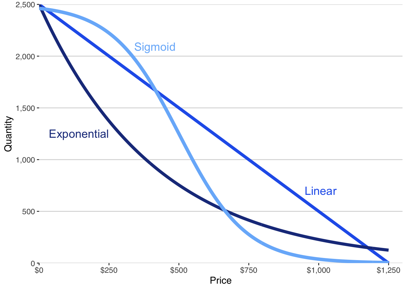
Linear demand says sensitivity is constant: every dollar of price costs you the same number of units, wherever you are on the curve. Simple, familiar, and it implies unlimited demand as price approaches zero and negative demand at high prices. Over a narrow range around observed prices that rarely matters. Outside one, it does.
Exponential demand says quantity falls proportionally rather than by a fixed amount, so sensitivity accelerates as price climbs. It never goes negative, which is an improvement, and it implies demand keeps growing sharply as price falls toward zero, which usually overstates how much more people will consume of something they already have enough of.
Sigmoid demand says almost nobody buys at high prices, almost everyone who might buy does at low ones, and nearly all the interesting behavior happens in a band between. That shape falls out of two things that are true of most markets: the population is finite, and cutting price stops helping once the people who want it already have it.
Sigmoid tends to fit entrepreneurial situations well, and it is worth being clear about why, because it fits the data better is not the reason. It respects two constraints the others violate. There is a ceiling, because only so many customers exist. And there is a floor, because past some price people simply opt out rather than buying a smaller amount. Look back at the staircase and you can see both: it is flat at the top, flat at the bottom, and steep in the middle. The empirical curve already had the shape.
That is the honest argument for a functional form. Not that a statistic preferred it, but that its implied behavior matches what you can see in your own data and what you know about how people buy.
Learn From Your AI
That argument only bites if you know what a fit statistic is. If \(R^2\) and overfitting are already familiar, skip this. If they are not, they are worth ten minutes before you choose a curve, because the whole point above is that the number most people reach for is the wrong one to reach for.
I am fitting a demand curve to willingness-to-pay data from a survey, choosing between a linear, an exponential, and a sigmoid shape. In plain language, explain what \(R^2\) actually measures, why a more flexible curve will almost always score higher on it, and what overfitting looks like when it happens. Then tell me what a fit statistic can and cannot tell me about which shape to trust outside the range of prices I actually observed. Here is my situation: [what you sell, roughly how many people you surveyed, and the lowest and highest prices they gave you].
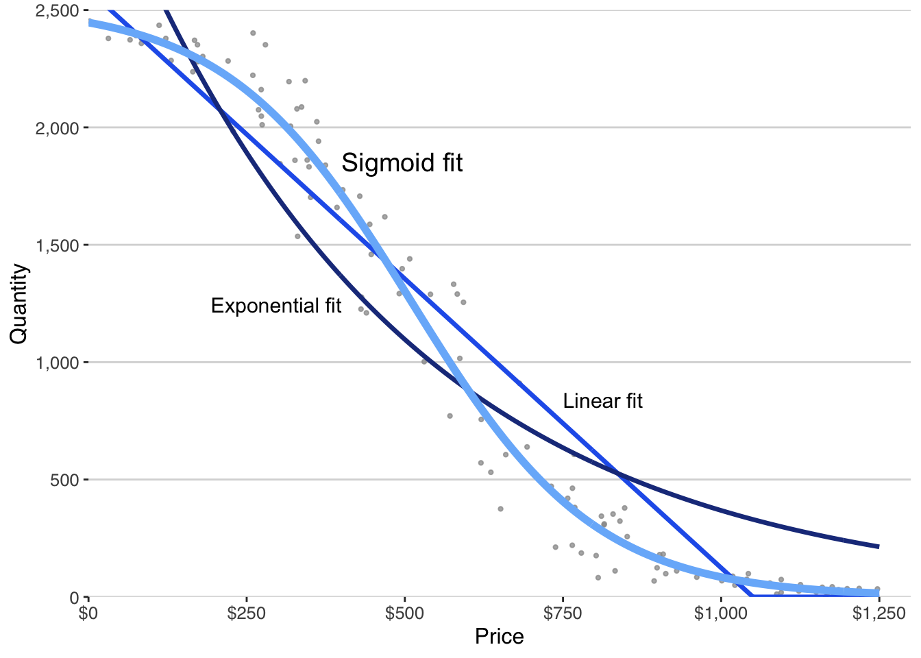
Each fit looks reasonable across the prices you actually observed. They diverge sharply outside that range, which is exactly where pricing decisions tend to live, and it is why the companion app fits all three rather than picking one for you.
Widen the window and watch it happen. The three fits below are the same ones above, computed once from the same evidence; the only thing the slider changes is how far past that evidence you look.
Watch the linear fit first, because it does not wait for the edge of your evidence. It crosses zero at about $1,050 and keeps going, so at $1,250, a price people in this sample actually answered about, it implies roughly minus five hundred units. Negative quantity is not a small inaccuracy. It is the model describing something that cannot happen, inside the range you sampled. The static figure above hides this, because it clamps the line at zero; the clamp tidies the picture and conceals what the model is saying.
The other two fail more politely. Exponential never goes negative, and it keeps promising buyers at prices nobody would pay, tailing off toward zero without ever getting there. Sigmoid settles toward zero and stays.
All three described the same evidence about equally well. They disagree completely about the world outside it, and about part of the world inside it, which is why choosing on fit alone is a way of not choosing at all.
The point of fitting several is not to hold a contest and crown the highest score. It is to see how much your conclusion depends on the assumption you made. When the three models tell the same story, your decision is robust. When they diverge, the divergence is the finding, and it tells you which additional evidence would actually be worth gathering.
Fit statistics are worth reading and they answer a narrower question than the one you have:
Which curve passes closest to the observed points?
is not
Which shape implies behavior I would bet on?
A model that fits a little worse while implying something sensible about customers is the better guide to an irreversible commitment. That judgment cannot be delegated to a statistic, and the app does not try to.
Is This Curve Safe to Use?
Software will fit a curve to almost anything you hand it. That is a convenience and a hazard, because a smooth line looks authoritative whether or not the evidence beneath it can carry a decision.
So before reasoning with a curve, spend five minutes on whether you should. None of what follows tests whether the curve is true. They test whether it is safe.
Does it behave like people? Three conditions, and checking them takes no economics at all. Quantity should never go negative. Demand should not explode as price approaches zero, because somebody who already has enough of a thing does not take unlimited quantities of it just because it got cheap. And demand should fall to nearly nothing at a high enough price, because everyone has a ceiling. A model that breaks one of these inside the price range you actually care about is telling you about itself rather than about your customers.
Does it match your staircase? You have both objects now, so put one on top of the other. Watch for a curve sitting consistently above the points, or consistently below, or fitting the middle and failing at both ends, or getting visibly dragged by two or three extreme answers. The most useful version of this check is also the crudest: cover the curve, look only at the points, and ask whether you would have drawn that line yourself. When the fitted curve tells a different story from the evidence, the difference is the finding.
Does it predict something you already know? Pick one price you have an intuition about, whether from a competitor, a comparable product, or your own wallet, and read the quantity off the curve. Is that number possible, for your unit and your period? This is not a test of accuracy. It asks whether you can reason about the output at all, and a curve that produces figures you cannot even argue with is not yet a usable object.
Can you check one point against the world? Every check so far has been internal, asking whether the curve is consistent with evidence you already hold. The strongest check is external, and it costs one question. Pick a price your curve makes a definite claim about, find a fresh sample of people who did not answer the first instrument, and ask only whether they would buy one unit at that price in the next period. Compare what they said against what the curve predicted. Expect the two to differ, and ask whether they are the same size. A predicted forty percent against an observed five means something upstream drifted, most often the sample, the framing, or the unit. The version of this test with real money is stronger still: a preorder, a deposit, or a pledge at a stated price validates one point with behavior instead of intention.
When it fails, go upstream. The temptation is to try functional forms until one looks better, which is the analytical equivalent of shopping for a second opinion. A curve that fails a sanity check is usually reporting a problem in the evidence rather than in itself: unit or period drifting between questions, non-customers left in the sample, a price question that felt like a negotiation, or a demand type that never matched the decision. Changing the shape conceals all of that and fixes none of it.
Before you accept a fitted curve
Your AI, or the app, will hand you a curve and a fit statistic. Do not accept either until you can do three things.
- Name the highest and lowest prices anyone in your evidence actually gave you, and say whether the price you care about falls between them.
- Read the quantity off the curve at one price you have an intuition about, and say out loud whether that number is possible.
- Point to the stretch of the curve your evidence does not cover, and say what the model assumed in order to draw it there.
If you cannot do all three, what you have is a picture rather than an estimate.
A curve worth using lines up with your unit and period, behaves like people, matches the evidence you gathered, and produces numbers you can argue about. Smoothness has nothing to do with it. That last property is rarer in entrepreneurship than it sounds, and it is the whole point of the exercise: a structured object you can argue with.
What the Curve Will Not Do
You now have an object you can reason with. It is worth being precise about what it does not settle.
It does not choose your price. Demand describes customers; prices are chosen by firms, and the choice involves costs, capacity, positioning, competition, and how much risk you can carry. What the curve does is discipline that choice: it rules out prices that cannot work and shows you where the tradeoffs get serious. Inside the surviving range, judgment is still yours.
It does not predict. It shows what your evidence implies under assumptions you can now name. As you learn more, it should move.
It does not stand alone. Profit needs demand, costs, and scale, and demand is the only one of the three you have to learn from other people. That is why it came first, and why the cost work waiting in the next part rests on something now rather than on nothing.
Putting It to Work
Ask yourself — can you build the staircase by hand?
Take your own responses, or twelve invented ones if you have not gathered any yet, and do the counting without an app. Sort the maximums from high to low, keep a running total, and plot the steps.
Then read three things off it. At the price you have been assuming, how many buyers are there? What happens to that number if you raise the price by ten percent? And where is the curve steepest, meaning where does a small price change cost you the most customers?
Now find the highest and lowest answers in your data and mark them. Everything outside those two marks is a place your evidence is silent about, and any smooth curve you fit will happily draw a line through it anyway. If the price you are considering sits out there, you have not learned what you think you have.
The move: Count first, fit second, and keep the two apart. The staircase is what your customers told you. The curve is what you assumed about everyone else.
The curve is the foundation and not the answer. Profit needs what it costs you to serve those customers, and cost turns out to be a subject where the accounting categories everyone reaches for are the wrong tool.